1 / 4
A comparison of a white logo on a textured crimson background and a red logo on gray paper, side by side.
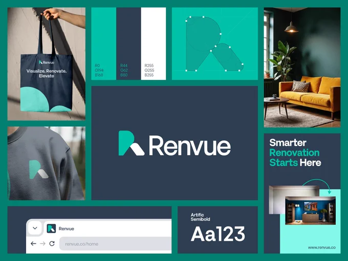
Renovation Service Brand Identity on a Teal and Navy Bento Board
 @panzestudio
 1/10
Geometric Graphic Poster Series Exploring Four Styles
 @marcelkargul
 0:05
AI Sales Brand Identity with Pixel Star Symbol and Serif Copy
 @khoiruldesign

Fashion Brand Presentation with a Photo Direction Moodboard Grid
 @ui_jaymez
 1/3
Travel Planner App Ads with Stamp and Ticket Motif Cards
 @wuraoladesigns
 1/2
Fashion Brand Identity Neutral Gray and Brown Color Palette
@ui_jaymez