1 / 1
An image comparing a Home/Discover pill tab bar and a round chat button in identical layouts on a light top half and dark bottom half, with symbol-pattern textures along the top and bottom edges.
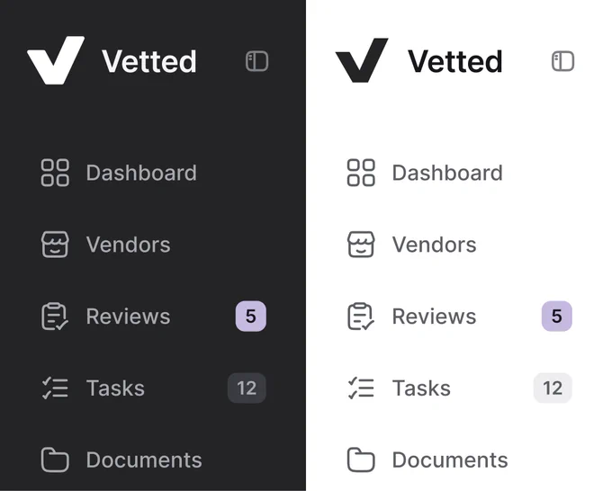
Sidebar Navigation Compared in Dark and Light Modes
 @nizamdesign
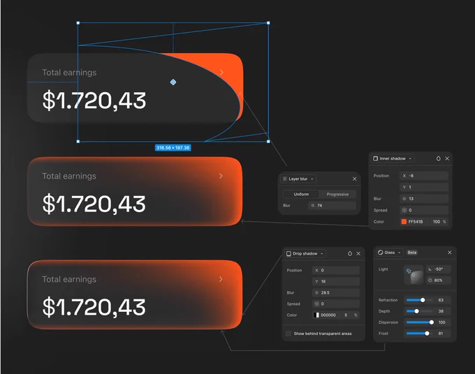
Glass Earnings Card — Step-by-Step Figma Layer Effects
 @jaydwivedi_

Product Card Compared in Light and Dark Moods
@jaydwivedi_ 1/2
Usage-Based Pricing Calculator Modal — Wireframe vs Final Design
 @cmnijhof

Travel Destination List — Soft Tinted vs Solid Badges
 @marcelkargul

Light Theme Surface Layering: White Cards on Gray vs Gray Cards on White
@jaydwivedi_