1 / 1
A dark mode card showing a reached usage limit, with upgrade and buy-credits buttons and progress bars for current session and weekly usage.
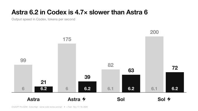
Monochrome Grouped Bar Chart Comparing Model Versions
 @miu21590
 1/4
Tactile UI Components — Text Formatting Toolbar and Status Badges
 @jaydwivedi_
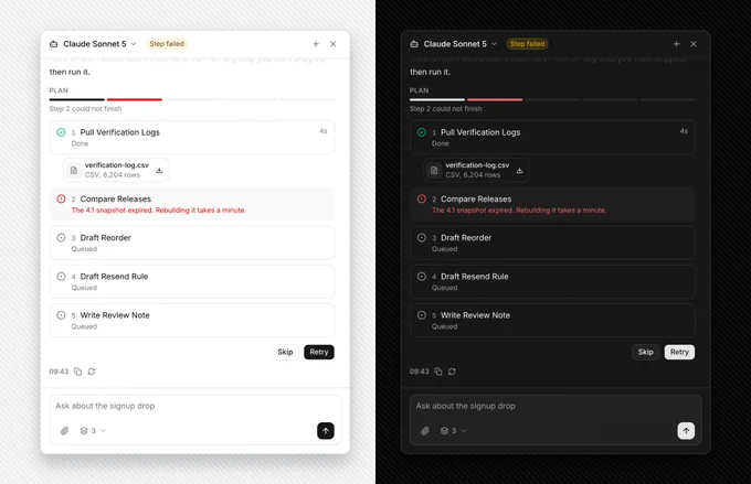
AI Agent Side Panel with Failed Step Retry and Skip Plan
 @faizalsukaimi

AI Token Budget Planner with Tick Slider and Dark Spend Panel
@faizalsukaimi 1/2
SaaS Footer with an Ask-AI Icon Button Row in Light and Dark Modes
 @louisnstudio
 1/4
Soft UI Component Set: Widget Cards, Status Badges, and Toolbars
@jaydwivedi_