1 / 1
A documentation page shows date and range pickers in a two column white grid; clicking an input opens a popover combining a month calendar with scrolling time columns, selected values invert to black pills, and the clip ends on a dark code panel.
 0:17
Storage Cleanup Panel with Sunburst Chart and Toggle List
 @disarto_max
 1/4
Tactile UI Components — Text Formatting Toolbar and Status Badges
 @jaydwivedi_

Client Portal Comment Thread Panel in Light and Dark Modes
 @faizalsukaimi

Blue Pill Button with Depth — Shadow and Stroke Layer Breakdown
 @marcelkargul
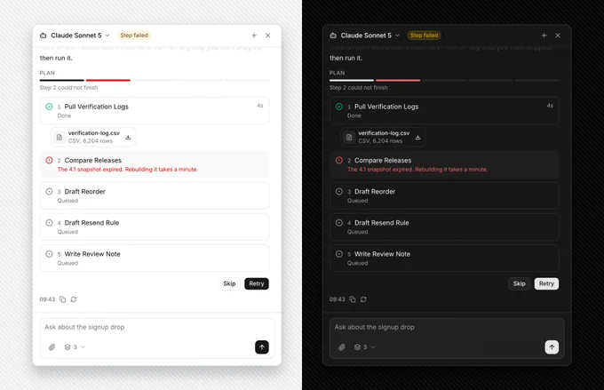
AI Agent Side Panel with Failed Step Retry and Skip Plan
@faizalsukaimi
AI Token Budget Planner with Tick Slider and Dark Spend Panel
@faizalsukaimi