1 / 1
Two mobile product detail screens compared side by side as A and B. A uses a full width image with a dot indicator, while B uses a vertical thumbnail rail with previous and next arrows.
 1/2
Agency Mobile Landing Hero — Pill Buttons Replaced with Square Buttons
 @marcelkargul
 1/5
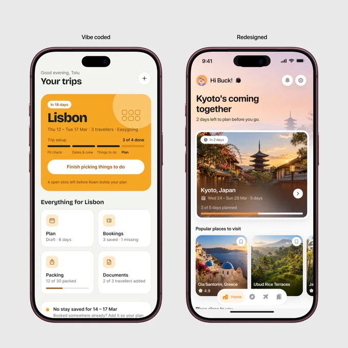
Travel Planner Mobile App — Home Redesign and Date Picker Sheet
 @wuraoladesigns
 1/3
Travel App Saved Places: Stacked Cards, Carousels, and Map Variants
@wuraoladesigns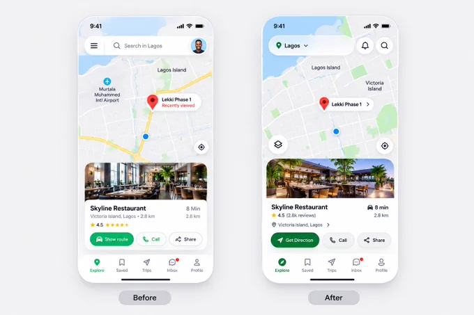
Map App Explore Screen — Before and After Place Card Redesign
 @iammuhammadmuiz

Map-Based Restaurant Discovery App: Before and After Place Card Redesign
@iammuhammadmuiz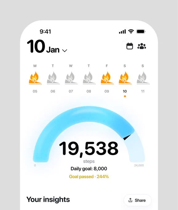 1/2
Step Tracker Fitness App — Two Styles of Arc Gauge and Weekly Streak
 @jaydwivedi_