1 / 1
A side-by-side comparison of a proxy service landing page before and after redesign. The after version uses a purple glow hero, a full-width feature card, and a two-column card grid with isometric illustrations.

Subscription SaaS Landing Page — Wireframe vs Final Design
 @jaydwivedi_
 1/2
Marketplace Homepage Redesign with Hero and Category Tile Grid
 @prem_uiux
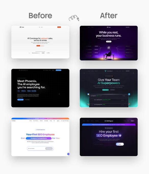
Three AI Agent Landing Heroes — Before and After from Light to Dark Glow
@prem_uiux 1/2
Language Learning Landing Hero — Mascot-Led Before and After Redesign
@jaydwivedi_ 1/4
AI Service Landing Page Redesigns — Four Before and After Comparisons
 @ui_jaymez
 1/3
Dark Fintech Landing with Bento Trust Grid and Feature Sections
 @piyushsphere