1 / 1
A component study comparing four alerts for success, warning, info, and error as lightly tinted rows on the left and white shadowed cards on the right.
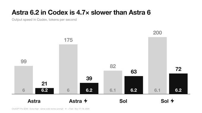
Monochrome Grouped Bar Chart Comparing Model Versions
 @miu21590
 0:17
Storage Cleanup Panel with Sunburst Chart and Toggle List
 @disarto_max
 1/4
Tactile UI Components — Text Formatting Toolbar and Status Badges
 @jaydwivedi_
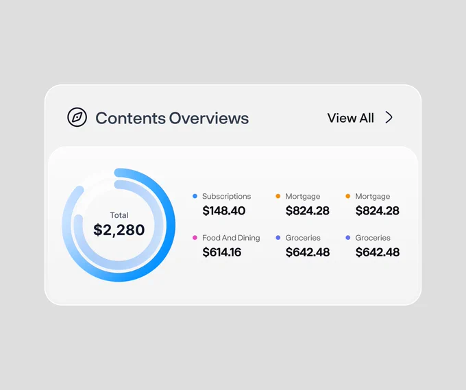
Spending Overview Widget with Dual Donut Chart and Category Legend
 @rakibulism

Keyboard Shortcuts Sheet Modal with Grouped List and Search Filter
 @faizalsukaimi

Client Portal Comment Thread Panel in Light and Dark Modes
@faizalsukaimi