1 / 4
A dark brown gradient card with a large headline and a logo belt at the bottom on the left, paired with a three-column booking calendar and time slot list on the right.
 0:17
Storage Cleanup Panel with Sunburst Chart and Toggle List
 @disarto_max
 1/4
Tactile UI Components — Text Formatting Toolbar and Status Badges
 @jaydwivedi_

Client Portal Comment Thread Panel in Light and Dark Modes
 @faizalsukaimi

Blue Pill Button with Depth — Shadow and Stroke Layer Breakdown
 @marcelkargul
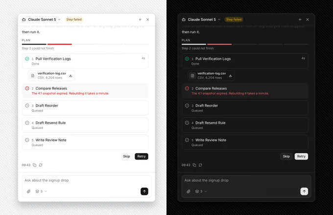
AI Agent Side Panel with Failed Step Retry and Skip Plan
@faizalsukaimi
AI Token Budget Planner with Tick Slider and Dark Spend Panel
@faizalsukaimi