1 / 2
The single wide variant, with one white list card floating centered on an olive gradient panel, showing status badges and an avatar stack.

AI Assistant Feature Cards in a 2x2 Illustrated Bento Grid
 @vektorastudio
 0:05
AI Agent Landing Hero with Pixel Dot Globe and Starry Gradient
 @pankajstwt
 1/20
Collection of 20 SaaS and AI Landing Page Hero Sections
 @prem_uiux

Personal Finance Landing with Lime Spending Cards and Four Feature Cards
@vektorastudio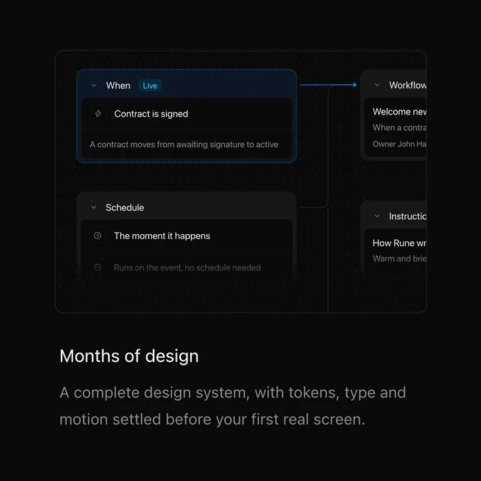 1/3
Dark SaaS Landing Feature Sections with Faded UI Snippet Cards
 @louisnstudio
 1/4
AI Agent SaaS Landing with Dark Bento Feature Cards and Pricing
@pankajstwt