1 / 1
A white carousel cover with a large two-tone headline above a side-by-side comparison of a loud before pricing card and a restrained after pricing card.
 1/4
Tactile UI Components — Text Formatting Toolbar and Status Badges
 @jaydwivedi_

Keyboard Shortcuts Sheet Modal with Grouped List and Search Filter
 @faizalsukaimi

Client Portal Comment Thread Panel in Light and Dark Modes
@faizalsukaimi
Analytics Metric Detail Sheet in Light and Dark Modes
@faizalsukaimi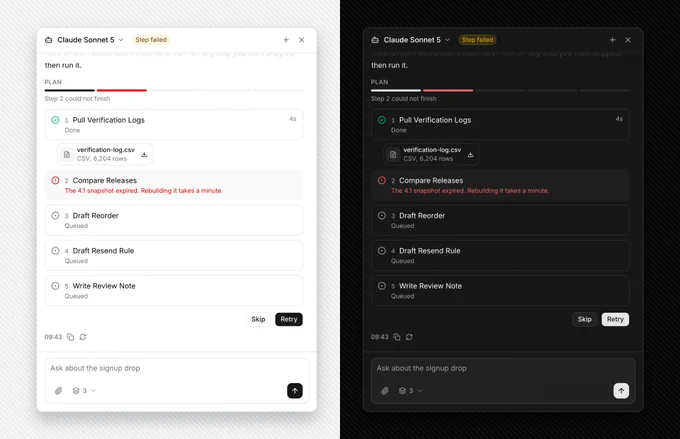
AI Agent Side Panel with Failed Step Retry and Skip Plan
@faizalsukaimi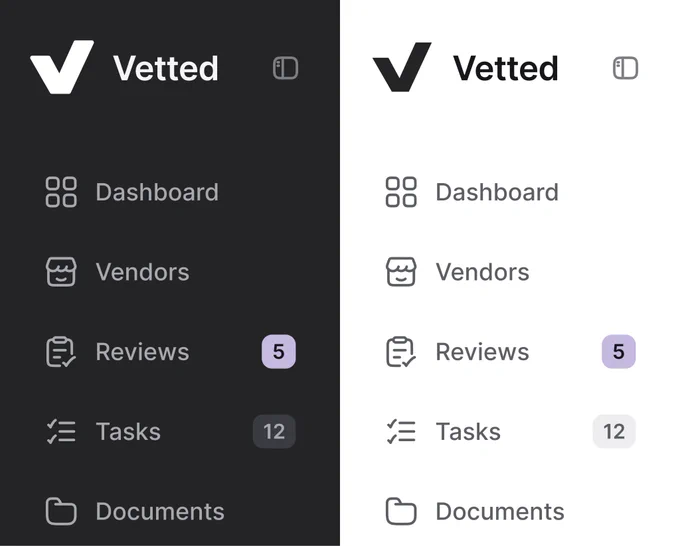
Sidebar Navigation Compared in Dark and Light Modes
 @nizamdesign