1 / 1
Two dropdown panels with search, product and dynamic source tabs, a source list, and a current selection area, placed side by side with different footer treatments.
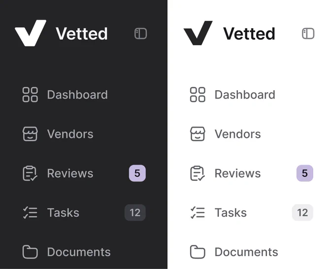
Sidebar Navigation Compared in Dark and Light Modes
 @nizamdesign
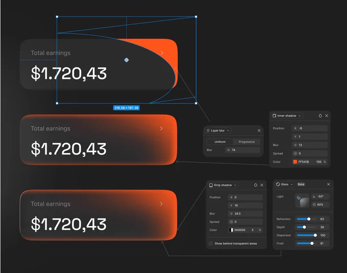
Glass Earnings Card — Step-by-Step Figma Layer Effects
 @jaydwivedi_

Product Card Compared in Light and Dark Moods
@jaydwivedi_ 1/2
Usage-Based Pricing Calculator Modal — Wireframe vs Final Design
 @cmnijhof

Travel Destination List — Soft Tinted vs Solid Badges
 @marcelkargul

Pill Tab Bar and Round Chat Button in Light and Dark Modes
 @uixamjad