1 / 1
Two deep green pricing card variants compared side by side on a light gray background. The price, checkmark feature list, and rounded CTA button are identical while only the placement of the green surface differs.
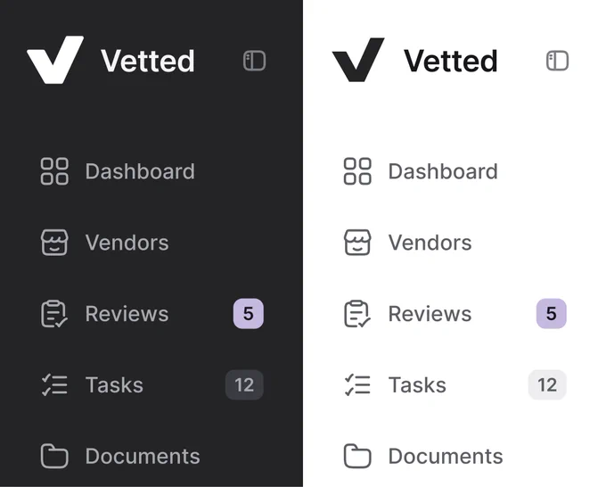
Sidebar Navigation Compared in Dark and Light Modes
 @nizamdesign
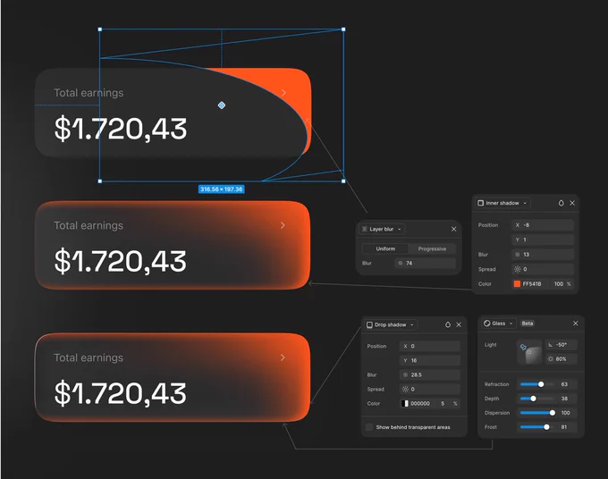
Glass Earnings Card — Step-by-Step Figma Layer Effects
 @jaydwivedi_

Product Card Compared in Light and Dark Moods
@jaydwivedi_ 1/2
Usage-Based Pricing Calculator Modal — Wireframe vs Final Design
 @cmnijhof

Travel Destination List — Soft Tinted vs Solid Badges
 @marcelkargul

Pill Tab Bar and Round Chat Button in Light and Dark Modes
 @uixamjad