1 / 1
Two rounded white cards shown side by side in default and hover expanded states, with a circular button in a curved notch and a bottom row of avatar and app icon stacks.
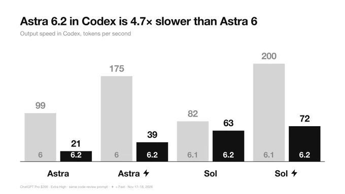
Monochrome Grouped Bar Chart Comparing Model Versions
 @miu21590
 1/4
Tactile UI Components — Text Formatting Toolbar and Status Badges
 @jaydwivedi_
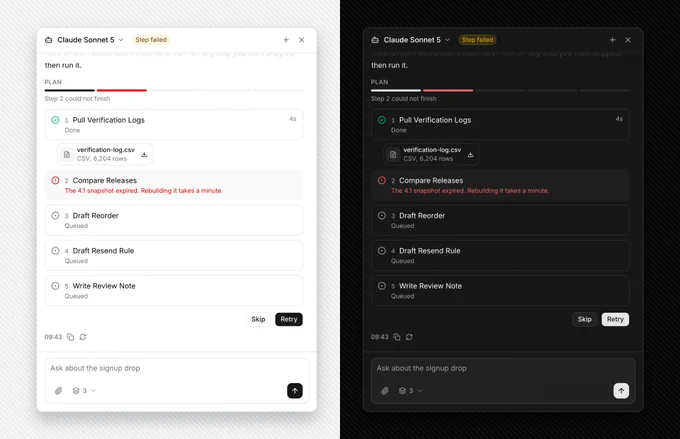
AI Agent Side Panel with Failed Step Retry and Skip Plan
 @faizalsukaimi

AI Token Budget Planner with Tick Slider and Dark Spend Panel
@faizalsukaimi 1/2
SaaS Footer with an Ask-AI Icon Button Row in Light and Dark Modes
 @louisnstudio
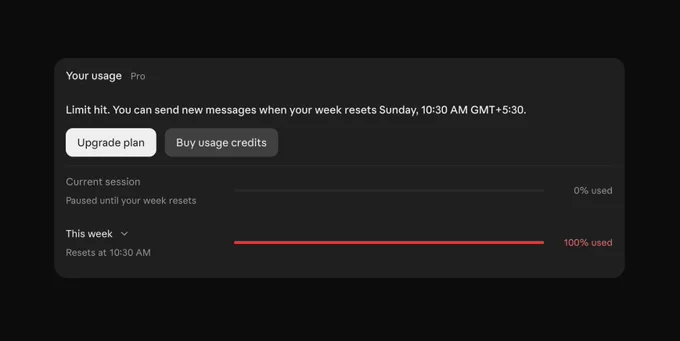
AI Tool Usage Limit Card with Dark Mode Progress Bars
 @prem_uiux